Friday, December 16, 2011

Artist interview with Dennis D'Amelio

 
 Dennis D’Amelio
Lecturer, Humanities Department, Division for Academic Affairs
BFA, Pratt Institute.
Office: Room E202
E-mail:
ddamelio@lagcc.cuny.edu
Phone: (718) 482-6038 
 
 On December 16, 2011 I interviewed artist Dennis D'amelio in LaGuardia Community College's art area. D'amelio is a humanities professor of the college and upon my arrival he was teaching a painting class. I didn't interrupt him and just sat and watched him teach. I had had the professor for a form and structure class a few semesters back and related to his artistic and designer style. I saw this opportunity to interview him as a way to learn more about him and his work which I admire.


D'amelio was responsible for developing the Fine Arts - Design and Industrial Design majors. The first of these two was the one that appealed to me the most in the curriculum and the one I've pursued since enrolling at LaGuardia C.C. 
 
He teaches courses like form and structure among other design and art studio courses.
Some classmates and I agree that Prof. D’amelio has a way with design and that is why he makes a great professor in this field because he has experienced design in different levels. His interests vary from architecture to painting to industrial design to prototype-making. He inclines towards organic shapes and allows his students to find inspirations from nature.

I expressed my interests in architecture to him and he advised me on the type of work Citi College (the college I’d like to attend) is looking for. Also on the work that might set me apart from the competition.
This professor is an inspiration to me and to his many design-inclined students.


Artist Interview Q & A: 

How did you discover your love for art as a kid?
As a kid I built a lot of model airplanes. When I was 10 years old, I moved from Queens to Long Island and was very lucky that the school system out there was really good, you know. Being kind of a dweeb, I hung out in the art rooms and made friends with a lot of artists or art-type and it was one of the things that I was very good at. So you know they encouraged me to do that.
So not being a terribly confident kid it was my way of creating identity of having an identity. Later on when I was a teenager, I wasn’t too crazy about Long Island so I would go to the city and visit the museums and art galleries. Little did I know that eventually it would be history. Some of the artists back then turned out to be very famous. I was fascinated by this work.


What inspired you to make art?
I have had people point out that I have a real eye for detail. I have a way of pointing something and have begun to realize that I almost take in too much information that my fuzzy little brain……
If I didn’t have art to make order out of all the stuff I’m observing. I’d probably be crazy.
I chuckle.
It is the art that allows me to take this information and organize it.


Dou you work from life, photographs or imagination?
I work mostly from life although I use photographs to help, but I don’t really copy the photograph. Like right now I’m working on a still life and I take a photograph just so that if I knock it over I can rearrange it. Sometimes I like to look at it compositionally as a flat composition. I get so dizzy with all the details that sometimes looking at the photograph allows me to eliminate those things that I am looking at.
Overwhelming?
Overwhelming.


What techniques do you use?
Oil paint mostly, and I swivel a pencil.


Do you work on a schedule or when you’re inspired?
Inspired is an awkward term for me because sometimes even if I’m not in the mood I try to discipline myself. Depends on how crazy my life is. There are times when I don’t go to my studio at all or when I go to my studio all the time. So I don’t really have a schedule. I wish I could, but with school and family…..

 
Why is your work so neat?
Because, again, I am inclined to make order out of chaos and it helps me. It satisfies me that in a messy world I can clean it all up. Which is absolutely impossible.
I laugh.
Yeah good luck!....

 
There are people out there who dislike contemporary art, they just don’t get it.
What would you say to them?
That they shouldn’t feel that they should make judgment in terms of good or bad because my experience has been that I walked into an art show with preconceived ideas and I just immediately reject something. Then overtime, I would revisit that art show and don’t know if it’s my mood or I’ve read or learned something now. So go and look at art as an experience, but you don’t have to feel you choose between good and bad.
I mean, I have my own aesthetic needs and my own sensibilities, but I try to keep my mind open so that I don’t rush to judgment.
Because it limits you in a way.
Absolutely, and also the way you judge art is like the way you judge people and politics you know.
True. Very true.


What’s the role of an artist in society?
That’s heavy.
Got ya thinking huh?
I chuckle.
I think it’s important for an artist to be one of those people that endeavors to do the best that they can base on their own criteria and hopefully they can become a model for the rest of society. So that what we do has cultural significance.
It might be self-directed, it may be all about you, but hopefully people will look at this and hopefully what you’re doing expresses some of the depths of human nature. Hopefully.
Thank you. That was one of the questions I was looking forward to hearing the answer to.


Where do you think art is going?
Oh, that’s a great question. I have no idea.
I like to think that it’s becoming more diverse and that we’re less locked in what the latest fashion is and what the best school of painting is.
We’re detaching ourselves from that.
I think so. Now there’s the danger of fragmenting too much, but I like to think we’re moving away from where one art form or one school of art is much better than another. We’re focusing more on how the individual expresses himself.
What’s really important for art or where I think art should go is that we should see that each and every artist’s sensibility is unique and I like to think that each human experience is unique.


There are times when an opportunity might come along for an artist and he might consider rejecting it because of fear of rejection.
How do you differentiate from intuition and fear of failure?
Ooh that’s a tricky one.
I can be disappointed because I’ll respect the judgment, but again we can’t please all the people all the time. I’ve come to realize that if someone is going to criticize my work, or reject my work I can give them a lot of reasons why I’m humble enough to know that I have shortcomings, that I am no genius.
Don’t publish that!
But I’ve found that people who are the most critical are often the ones that don’t have knowledge.
I agree
Over time, you begin to realize that you become your own authority. You become involved more in your own art history than history in the moment or even art history in the past. So you should be open to criticism and always be open to it constructively and at a certain point you start to callus up and you understand that what you do has meaning for you.

I thanked Professor D'amelio for giving me the chance to interview him and we went our separate ways.
I learned a lot from him today.


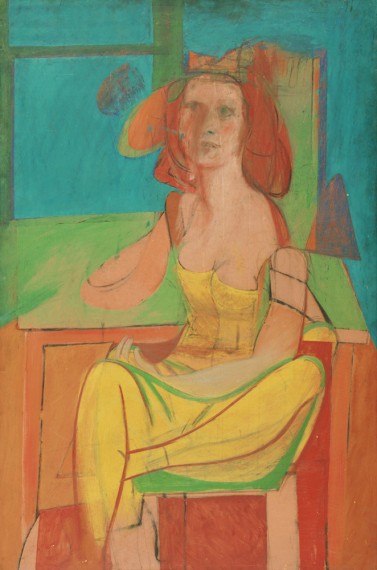
Pictures courtesy of : 
http://www.thelifeworkstudio.com/subpages/gallery.html
and
http://www.laguardia.edu/humanities/visart/faculty.aspx

Sunday, December 4, 2011

David Smith: Cubes and Anarchy

David Smith "Blue Construction", 1938 (sheet steel, baked enamel finish) 92.1 x 72.4 x 76.2 cm


I visited the Whitney Museum and upon arrival was immediately attracted to the building’s design. This is my type of environment, I thought.  I walked to information and explained to the receptionist that I was a student at LaGuardia, but had forgotten my ID. She contacted the manager who in turn allowed me in once I probed my student status through signing in to the college’s website. I now assume she thought I was trying to get in for free because she gave me a ticket without me paying. Which was nice, but all I wanted was my student discount.
            Without further distractions, and considering I had other museums to visit that day, I hopped on the elevator onto the 4th floor where David Smith’s Cubes and Anarchy exhibition was being held and was greeted by his amazing sculptures. I walked around trying to enjoy all the cubes, architectural lines and mathematically symmetric shapes of Smith’s work. Then, once I had reached my starting point once again, I stopped and drew a few of my favorite pieces. Some included The Hero (1951-52), 5 ½ (1956), and Blue Construction (1938).
            I respect the sculptor’s use of cubes, bent steel, roundness, and zigzags throughout his work. It made me feel nice that I could relate to his work and wanted to copy some of his techniques in a sculpture of my own. In some instances he painted the steel to give it a more organic touch which was refreshing. It was also nice to see The Hero a sculpture I had seen before at the Brooklyn Museum in a different context from how I had seen it before. At that moment, I couldn’t recall where I had seen it, but a couple of semesters ago, in my sculpture class I was assigned to visit the Brooklyn Museum. I had to draw and analyze sculptures by Rodin, as well as more contemporary pieces like Smith’s. So it was nice to have that feeling of Déjà vu when I came upon it.
            For anyone who is interested in design like I am, it is vital to look at sculptures such as these and find the principles of design within them. There is rhythm working side by side with proportion and balance. There are lines both present and omitted creating volume and negative spaces through which light can penetrate. I could still see the angles and the beautiful patina in his Blue Construction which he created by using powdered glass and baking it until it melted and blended into various dark hues. Including a royal-like shade of blue anyone would enjoy looking at.
            I had seen David Smith’s work before, as I mentioned earlier, but it wasn’t until I saw so many of his sculptures together that I began to admire the artist as a great contemporary sculptor. I don’t think I’ll be forgetting his name anytime soon.


cites: 
Whitney.org. "David Smith: Cubes and Anarchy". The Whitney Museum. 4 Dec. 2011 <http://whitney.org/Exhibitions/DavidSmith>

Friday, December 2, 2011

"Bad" Drawing

Deformation of the figure: "Club foot"
My second son Diego was born with a condition called club foot. This is a condition which makes a foot have a tendency to shift inward like a golf club. Hence the name: club foot. The specific causes for the clubbing are unknown, but advances in orthopedics, and physical therapy have almost eliminated any future setbacks in mobility. It is known that it affects twice as many boys as it does girls and in most children it will appear in both feet. Fortunately, Diego had only one. His right foot, a lot like the drawing seen above.


Non - Art Resource: "MTA Bus Handle"
I have always been attracted to mechanical & industrial shapes. This is a Q39 bus rail handle that caught my attention while on a commute from LaGuardia C.C. to Ridgewood. Its design allows it to swing from side to side following the bus' every rhythm. Try to hold on tight, the driver's a maniac! Wouldn't want you to fall.


Art Resource: Seated Woman by Willem de Kooning

When I went to see de Kooning: A Retrospective at MoMA, I was immediately embraced by this painting. I decided to draw it and actually lost track of time as I followed and imitated each acute line carefully thought out and displayed by the artist.


Wednesday, November 30, 2011

9/11 Memorial

This picture shows people gathered around the 9/11 Memorial Plaza's south pool. Apparent is the involvement of those pictured with the open space, atmosphere, and engraved names pictured. On the right, we can peek at the water falling as the infamous Twin Towers once fell. The reflections emerging from the building windows mirror the urbanity around the site and so do the eclectic faces of those who attend. 

Here are the names of the deceased on September 11, 2001. There are African Americans, Asians, Hispanics, Middle Eastern, and Caucasian names and it mimics those who visit the site daily showing how the attacks on the World Trade Center affected the entire world.
My class " Art in NY " on top of all the things going on around this city. "Cheese"


The Museum of the American Indian


This picture was taken at the Museum of the American Indian and was one of the many  pieces I enjoyed viewing. Here there is art from 'Indian' tribes from both American continents. There are artifacts from the Central American Mayan and Aztec civilizations. Caribbean Taino sculptures and South American Mapuche carvings. As well as American and Canadian Inuit, Yuit and Navajo tribes of more recent and contemporary societies.

Above, you can appreciate my favorite painting in the exhibition and although I was yelled at by a security guard for taking this picture in a restricted area, it was totally worth it. A poem on the lower left side reads: "Note Well: Contain any force that you might possess, you never know when they'll be needed". I like the four rectangles at the top which I like to think, show a little side of the artist. The fluttering wing on the left side above the poem, show the force the artist is referring to being released at its precise time. It was totally worth it. Don't you agree?

Also pictured above: 

Taino water vessel, Dominican Republic, ca. A.D. 1200-1500 (Clay) 
Maya ritual blade, Belize, ca. A.D. 700 (flint)
Hupa apron and skirt, California, ca. 1900 (Hide, plant fiber, pine nuts, bear grass, abalone shell,brass thimbles, glass and seed beads)


Thursday, October 6, 2011

Breakfast Still Life


 I started this piece by placing three eggs in a small bowl where sunlight could hit it. It was early morning when I started so I took advantage of the sunlight. Afterwards, I arranged complimentary items beside the eggs which I used to make my eggs-in-a-bowl more believable. I incorporated a loaf of Italian bread, a bottle of orange juice and a small glass filled with it, and a 'lucky bamboo' plant I have at home. Some of the items that I normally see around breakfast time. I intentionally left out the brand of orange juice assuring I don't patronize any particular brand, (No matter how much I use it.) 

I used titanium white and mars and ivory blacks to vary the closer warmth and the distant coolness of the shapes. I varied the intensity of the grays to reflect optical hue changes. The orange bottle cap and the green bamboo for example, are much grayer than the neutral shades of the see through surfaces, the bowl, and the bread.

I continued to the second phase of my piece which involved collage. Initially, I wanted to vary between the polish of the surfaces, but circumstances made me stick to matte print. I cut paper accordingly and arranged it around the previously painted items to fill the negative spaces and create an eclectic table cloth. 

I enjoyed painting and designing this piece mainly because I was able to craft and explore two of my favorite manifestations.

Friday, September 30, 2011

September 11 @ MoMA PS1

 This was one of my favorite pieces because it displays the bright colors of our precocious nation.

Now Showing @ Moma PS1 through January 9th, 2012

 
George Segal - American artist - 1924-2000 
'Woman on a park Bench' 1998 (bronze w/ white patina & metal bench)
         
In the room seen above one could reminisce about September 11th 2011, as we see various pieces incorporated into a brightly-lit room. There is a woman seated carelessly on a bench minding her own business. She holds dearly to her purse and seems as if she were about to smile, but not quite. There is material scattered along the center of the floor which resembles ashes done by Roger Hiorns a British artist born in 1978. It is an 'atomized passenger aircraft engine' and he left his work Untitled. In addition, the theme from Patriot (a solo by Mark O'Connor) can be heard playing in the background to add to the mood. The audio is 6:40 minutes long and it was incorporated by John Williams an American artist born in 1932.

 Filmmaker Jem Cohen's addition to the show is in the form of a 6:00 minute video with sound & in black and white. Little Flags (1991-2000) is an excerpt of a film made by Cohen who was recording a parade that was lead along Broadway to celebrate the end of the Golf War. In the film we can observe the crowd maneuvering around lower Manhattan in a sward of paper. Looking at the picture above (from the film) we can see the similarities between the film and the city on that September 11, 2001 morning.


Another piece (not shown) is a canopy of black bunting which welcomes the visitors to the 2nd floor of the museum. It was created in 2001 by Fiona Banner an English artist born in 1966 by using vinyl and rope. Black Bunting (2008) can be interpreted as a touch of celebration to this one-decade-after tribute without robbing from the mourning sensation implied by the color black.

Wednesday, September 28, 2011

Lee Ufan: Marking Infinity

Lee Ufan is a Korean artist-philosopher whose work was on exhibition for the first time in the United States at the Solomon Guggenheim Museum. This man has made it his business to bring nature into non-traditional spaces. He uses his philosophical background to invoke tranquility and gentleness into normally thought of as rough materials. He is fond of using stones beside steel (as seen below) and hard edges beside soft textures like cotton and fabric. Another of his great techniques involve using his brush while full of paint and tapping the canvas until the medium runs out. It creates a very interesting pattern which can be a metaphor for how uncertain we are about life itself and really not knowing where it might lead us. The bottom-most picture shows large brush strokes featuring a very difficult to make value scale which the artist achieves by layering. These same squares can be appreciated on a wall in a symmetric room at the museum in which the artist intentionally chooses to place the shapes on the sides of the wall instead of the center. Honoring nature's asymmetry in a mathematically square room.


Relatum (formerly Phenomena & Perception B) 1968/2011, steel, glass & stone

Relatum - residence, 1988. steel & stones

de kooning: A Retrospective at MoMA

Now Showing at MoMA de Kooning: A Retrospective September 18, 2011–January 9, 2012

De Kooning: A Retrospective is an exhibition at MoMA which shows some of the works of Willem de Kooning a Dutch American abstract expressionist artist. It presents a sort of chronological example of the artist's growth in a span of about 70 years. In exhibition you will find de Kooning's famous Women series making present the familiarity de Kooning had with the female body and its movements. There are also paintings like Seated Woman C. 1940 and his well known Pink Angels. c. 1945 (both seen below). I personally liked Woman With Bicycle (also below) for the careless happiness possessed by the woman which he emphasizes by painting twice and its ambiguity when it comes to the bike. The "bike's" simple shapes left many of the visitors I encountered at the museum wondering how to spot it. This ambiguity is fluent in many of de Kooning's paintings.
Woman and Bicycle, 1952–53. Oil on canvas, (194.3 × 124.5 cm)

Seated Woman, c. 1940. Oil and charcoal on masonite 54 1/16 x 36" (137.3 x 91.4 cm)


Pink Angels c. 1945 Oil and charcoal on canvas
52 x 40" (132.1 x 101.6 cm)

Thursday, September 15, 2011

"Witness - A look back to the future"

On September 11, 2001, New York city's history was changed forever.  "Witness - A look back to the future" is an exhibition that features works created by local artists, art professors as reflections about their feelings towards the World Trade Center tragedy. Another "sister" exhibition "10 Years Later" features work done by LaGuardia students and is overseen by Professor Bruce Brooks one of the artists taking part of the tribute. The exhibition can be enjoyed at LaGuardia Community College on the 5th and 4th floors of the E-building.

It is almost impossible not to have a feeling of pain and impotence in the presence of the artwork. Experiencing this reminds us how not only NYC changed, but also its artists as well. Through their work these artists have learned to deal with the shadow of that day in a way that aids them and their audience heal through this visual tribute. We may forgive, but here there's proof we'll never forget how September 11 changed all of us.

One of the pieces that welcome the visitors is a picture of sculptor Michael Rolando Richards' Tar Baby vs. St. Sebastian (shown below) . The contemporary African American artist created his "Tar Baby" in 1999, roughly two years before he met his demise in the 9/11 attacks. He was staying in his 92nd floor studio located at the World Trade Center. Looking at his sculpture which emanates an air of irony because of the similarities between it and its maker's fate.


I think it takes a certain type of person to be an artist. To a certain extent, it has to come from within. This allows artists to explore their capabilities and set them free. As a reward, they get to tap into varying states of their psyche which resurface in their artwork.

 Tar Baby vs. St. Sebastian, 1999
Resin and steel, 81 x 30 x 19


Michael Rolando Richards was a Costa Rican and Jamaican sculptor who perished on the World Trade Center attacks while staying in his 92nd floor studio. Here we see him beside his famous Tar Baby vs. St. Sebastian.